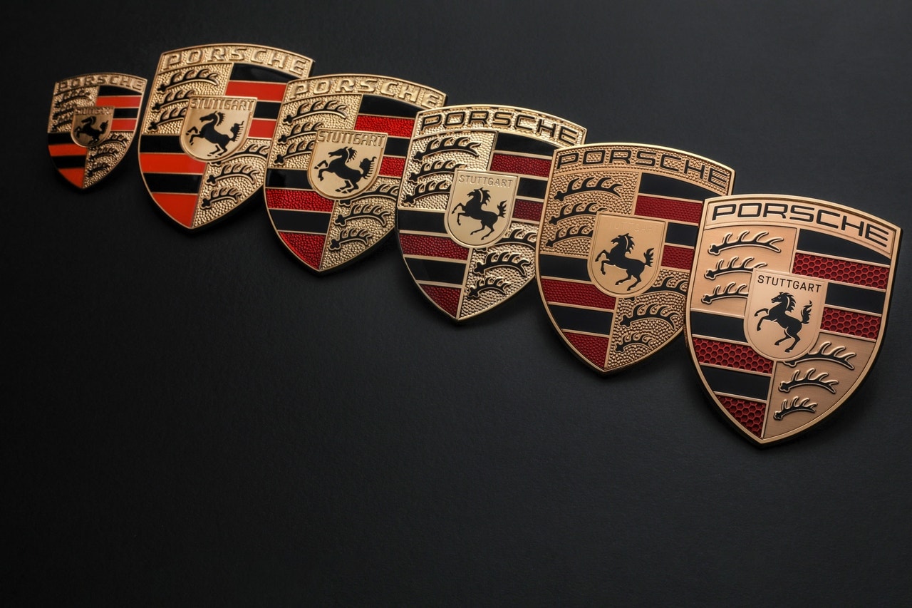
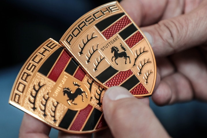
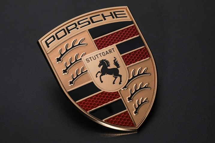
- Porsche's new logo features subtle changes to the iconic crest.
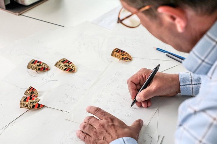
- The automakers says the new logo took an insane three years to make.
- Updated badges will make their way to cars starting at the end of the year.
This Is Porsche's Modernist New Logo; It's Barely Changed
Porsche has a new logo, but spotting the differences takes a keen eye
In any industry, redoing your logo is a dangerous business. You may end up with the "KN car" situation Kia ended up in not too long ago when it gave its logo a new look. In the world of cars, we’d refer you to Formula 1’s somewhat recent logo redesign, which was a radical departure fans argued over for months. Elsewhere, Aston Martin did the opposite, barely changing things. Porsche has decided this path is the one to take, debuting its “new” logo this month.
It feels a lot like one of those games on a kids' menu — spot the differences between the two pictures, and maybe your server will bring you a little dessert. Look closely enough and there are differences. Porsche says that the design took a barely believable three years.
“The time factor is very important in a maturing process such as this,” says Joachim Paetzel, specialist for Color and Trim at Style Porsche. “A trademark is not designed ‘off the cuff’ within a few days. You have to go back to it again and again, sometimes at longer intervals. The second or third look can reveal to you things that you want to optimize, until it finally achieves a harmonious, natural effect.” Designers also spent time making sure that 2D and 3D applications for the badge are identical, which apparently was difficult to do.
The most obvious change is in the red of the iconic badge, which now features a honeycomb pattern instead of a more solid, slightly brighter red. The brushed metal on which the crest rests has gotten a minor change, now more gold than the previous bronze. The horse at the center has some more detail to it, with the legs, tail and face now slightly more defined. For the first time, the “Stuttgart” text on the crest is now black instead of the surrounding gold-bronze color. You may think the branch-like objects are, in fact, branches, but those are stylized deer horns, which now rest on a flat field of bronze instead of the dimpled design.
If you weren’t aware, various parts of the brand’s now iconic crest are borrowed from German culture. For example, the horse crest is from the seal of Stuttgart. The name has its origin in horse breeding ("stud garden," to translate more literally). Those deer antlers are taken from the crest of old Württemberg-Hohenzollern. That was a West German state until it was merged with Baden-Württemberg in 1952. Regardless, Porsche says that badges will be fitted to cars starting at the end of 2023.
Edmunds says
The new Porsche crest really is different. You've just got to look really, really hard for it. It does look better to our eyes, and the new color is a better fit for the brand. Of course, the fact that it took three whole years to design is absurd, and perhaps the process could've been a little speedier.


 by
by